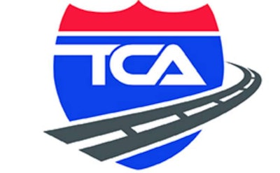
The Board of Directors of the Truckload Carriers Association (TCA) has adopted a revised logo to represent the organization.
The new design is the result of a two-month effort by TCA’s Communications & Image Policy Committee, led by co-chairs Sherri Garner Brumbaugh, president and CEO of Garner Transportation Group of Findlay, Ohio, and Wendy Hamilton, senior manager of sales marketing and training for Pilot Flying J of Knoxville, Tennessee.
Although the logo maintains the same general shield design and colors as before, the new look is more modern, print-friendly, and easier to read, especially when reduced to small sizes. The outline of the United States — which had carried over from previous logos used in the 1980s — has been eliminated to better reflect TCA’s mix of both U.S. and Canadian members.
A road now circles around the logo, moving in an upward direction, which represents new horizons, higher education, and more efficient ways of doing things. It also points the way to new members, new relationships and networking opportunities between those members, and more prosperity for those members who take advantage of all the resources that TCA provides to them.
The logo update is the first major change since TCA’s new President Brad Bentley, began leading the organization about a month ago.
“Our new leader is a direct reflection of where we’re going in the future and the connections we are forging with both our current and potential members. Our hope is that our new logo reflects that,” said Shepard Dunn, president and CEO of Bestway Express, Inc., of Vincennes, Indiana, and the chairman of TCA. “The logo is fresh, it’s new, it connects with a new generation, and it captures who we are.”


